

Who’s afraid of red, yellow, and blue?
Workshop focussing on colour perception, interaction, meaning

Full day workshop
CONTENT
Personality Design by Inez Michiels
Interaction of Colour by Maja Kaurin
Colour and Meaning by Jeannette Hanenburg
Applied Synaesthetics by Inez Michiels
Personality Design
Personality can be a powerful asset for design. Personality has a significant effect on our decision-making process both in marketing and industrial design. We are drawn to designs that resonate emotionally with our personality. In (interior) architecture, tailor-made spaces meeting a person’s needs will result in positive identification and client well-being. Personality likewise plays a crucial role in fashion and styling, as clothing allows for the ultimate expression of one’s identity and mood. Knowing how to incorporate personality into your work is essential. Inez Michiels presents her scientifically tested ID-Colour assessment tool providing quick and playful insight into the design preferences of end users.
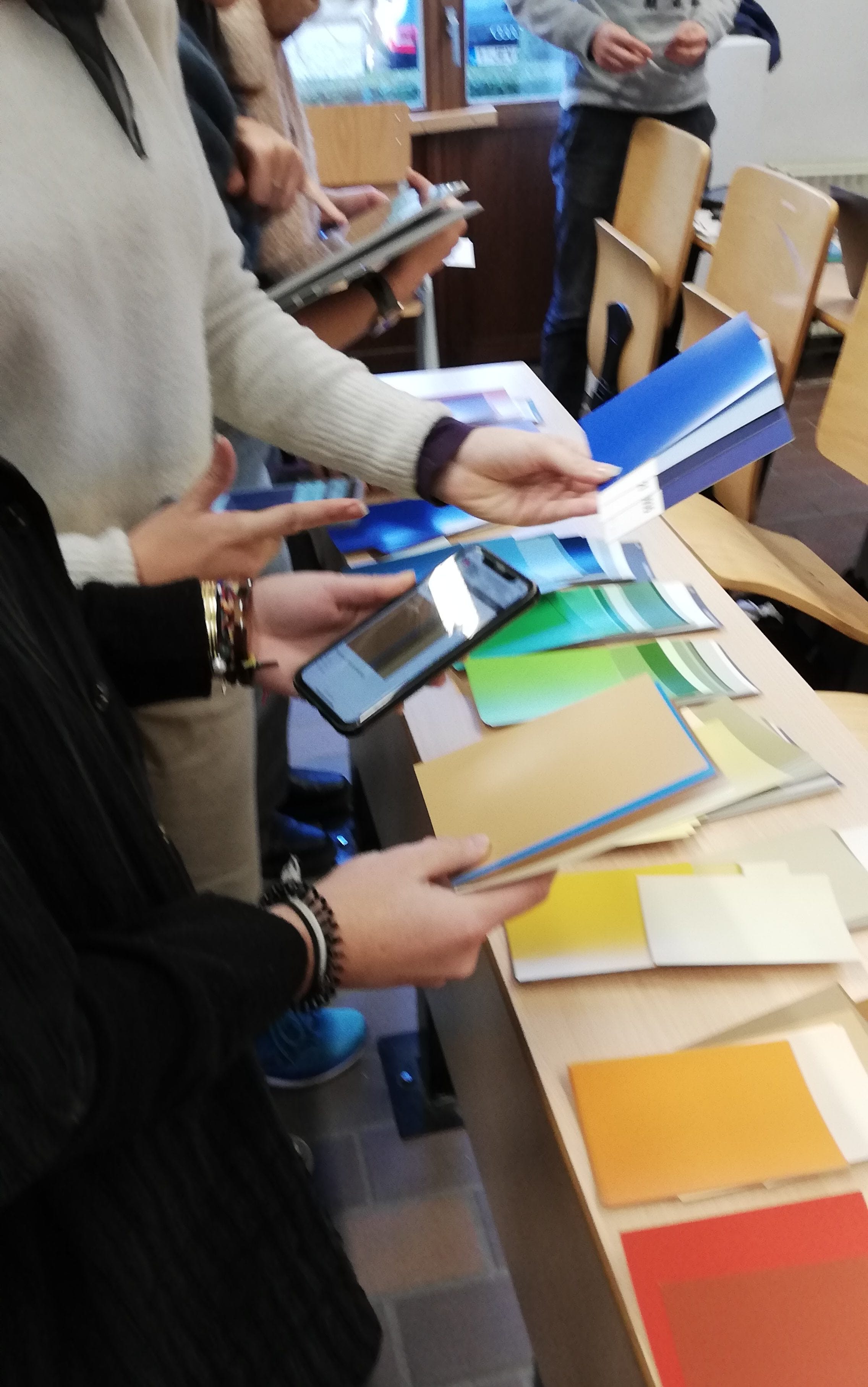
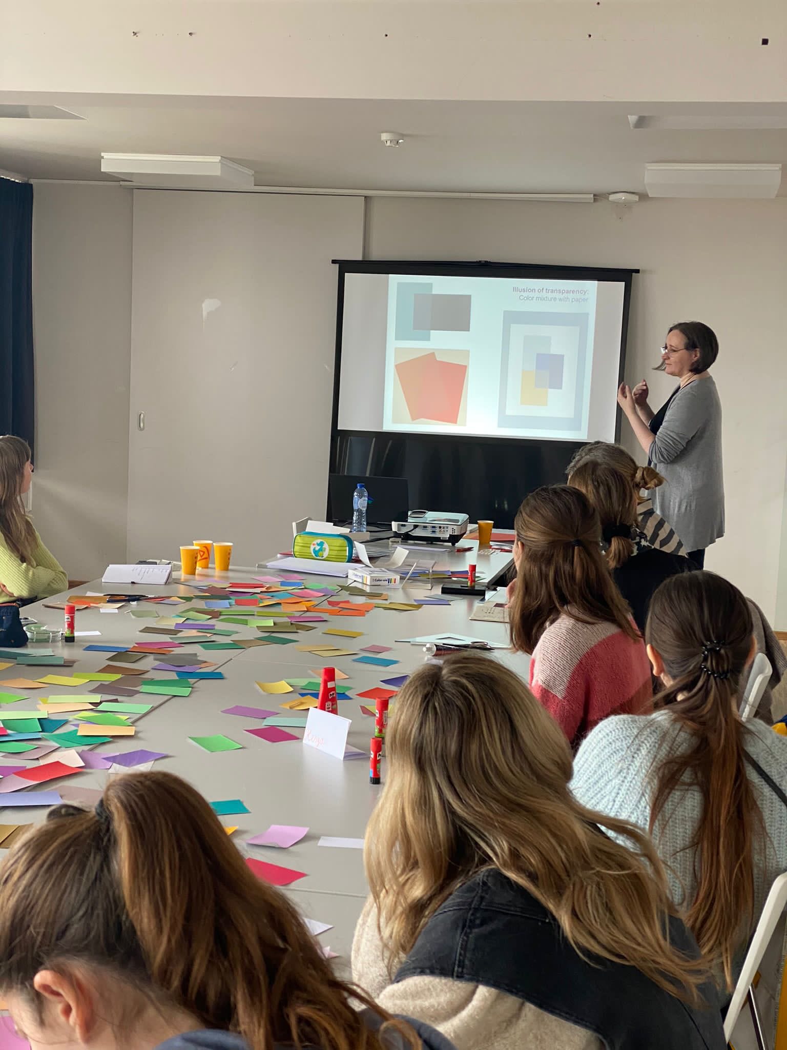
Interaction of Colour
by Maja Kaurin
Through various exercises participants learn about colour effects produced through the interaction of colour, comparing the factual and actual colour and thus exploring the principles of colour relativity, temperature, the illusion of transparency and space, and the afterimage effect. By gaining a greater colour awareness they will be able to further explore and use those colour design principles in their own art or design practice.
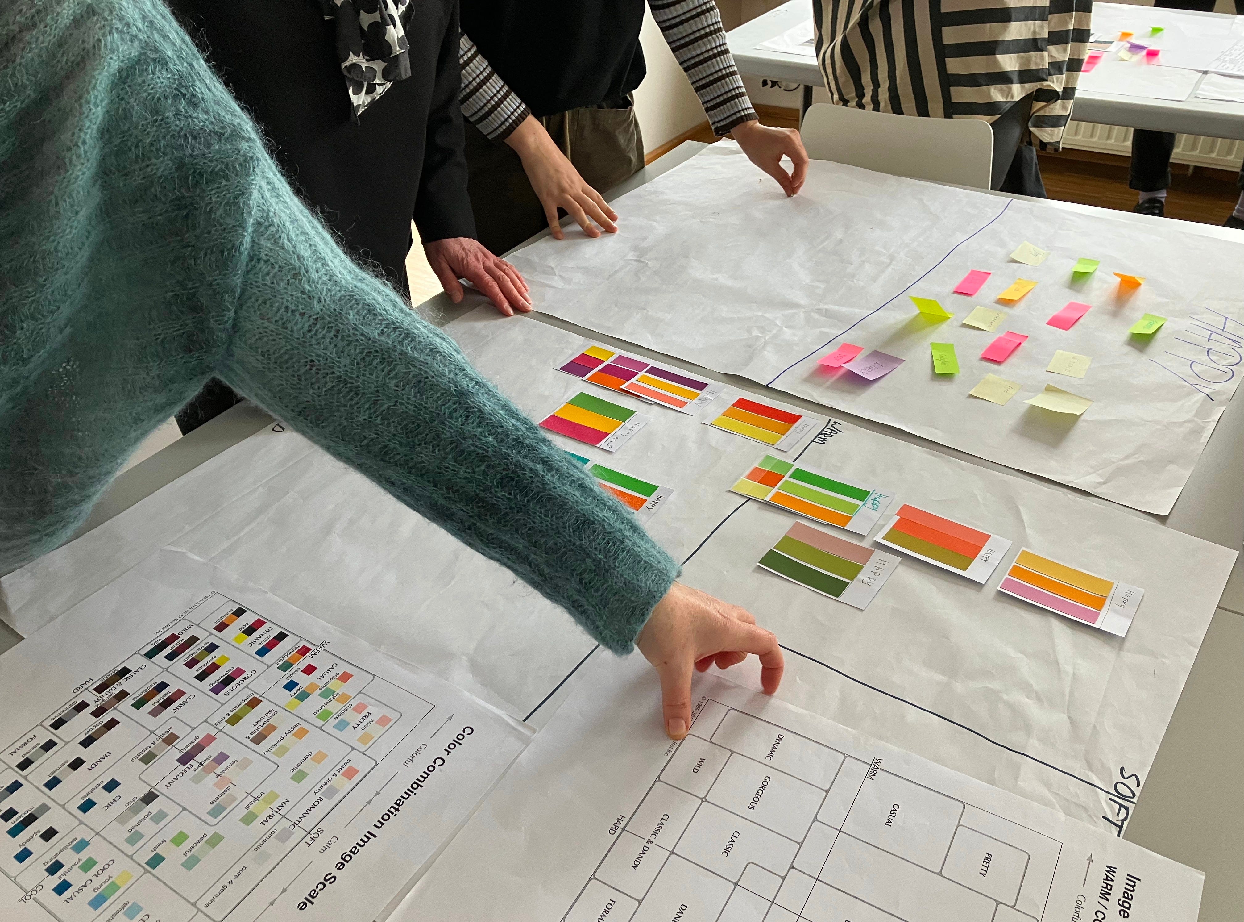
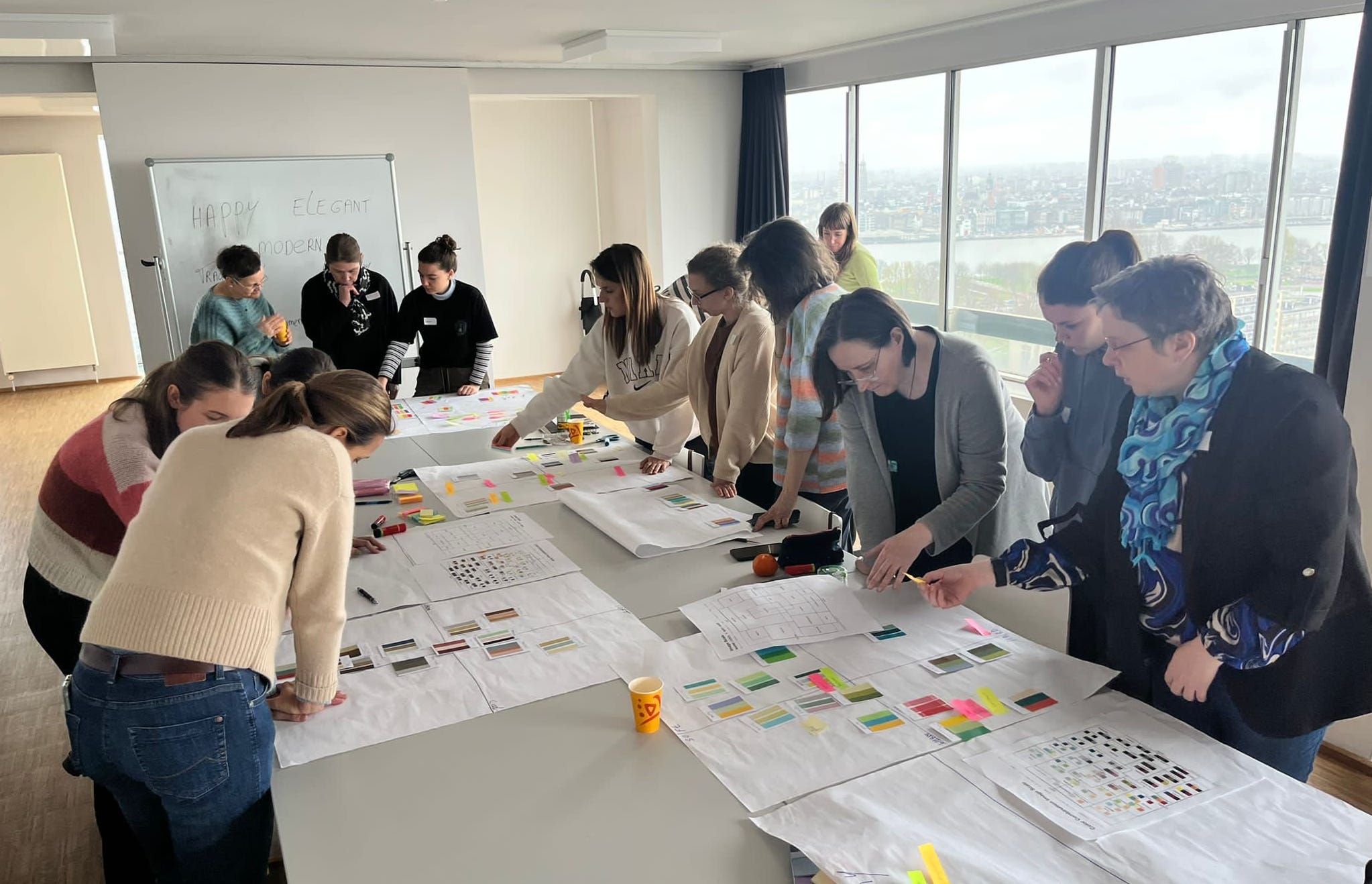
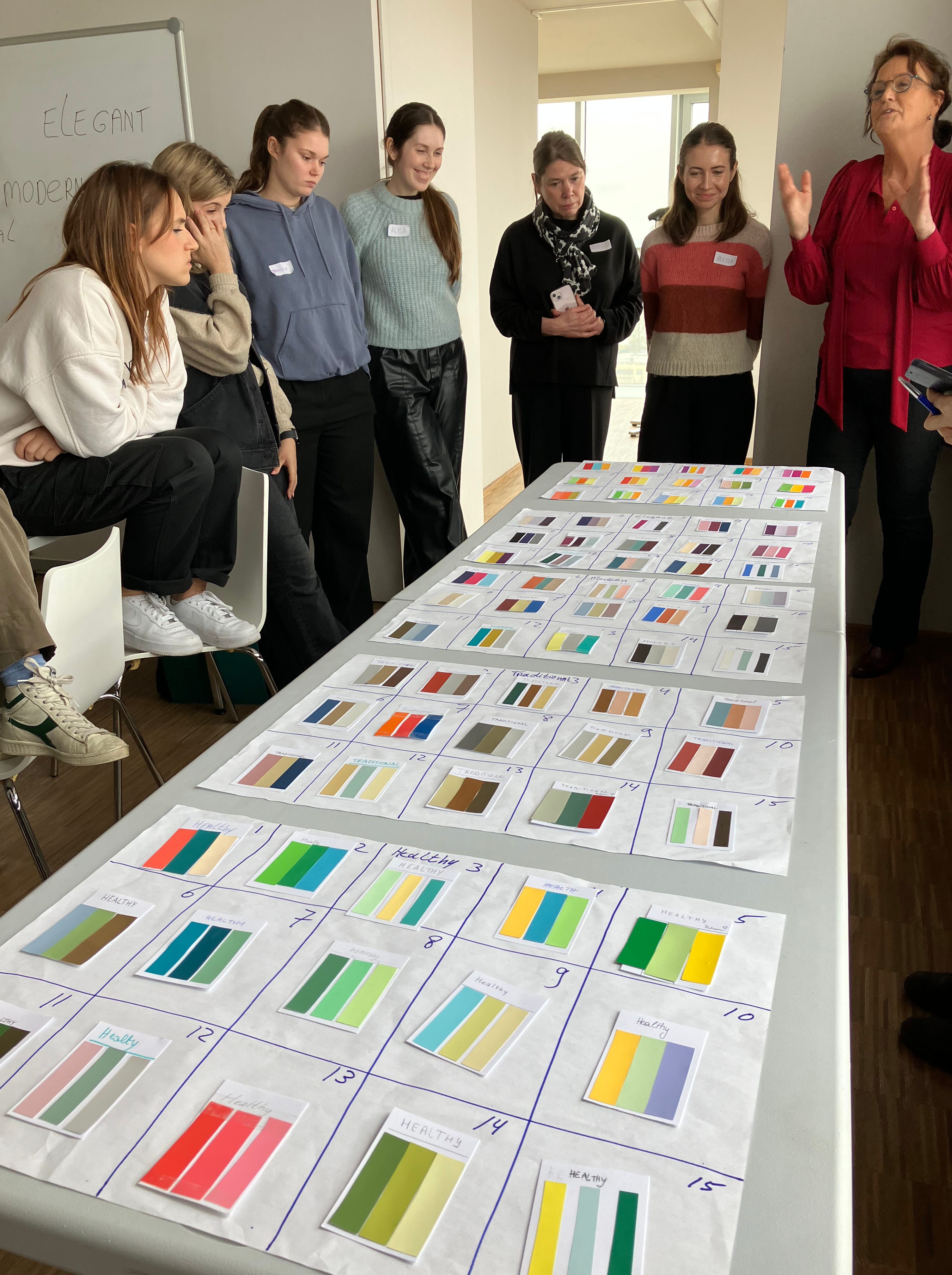
Colour and Meaning
Designing with the colour image scale.
The colour image scale is a tool to combine colours in an easy way, developed by Japan’s leading colour psychologist, Shigenobu Kobayashi. The Colour Image Scale is useful for describing the similar and contrasting images of colours. The scale also allows the classification and correlation of various objects (shapes, patterns, clothing, foods, etc.) and the study of personal preferences in these and other areas.
The colour image scale allows you the expression of any mood, lifestyle, or taste through the creative use of colour combinations.
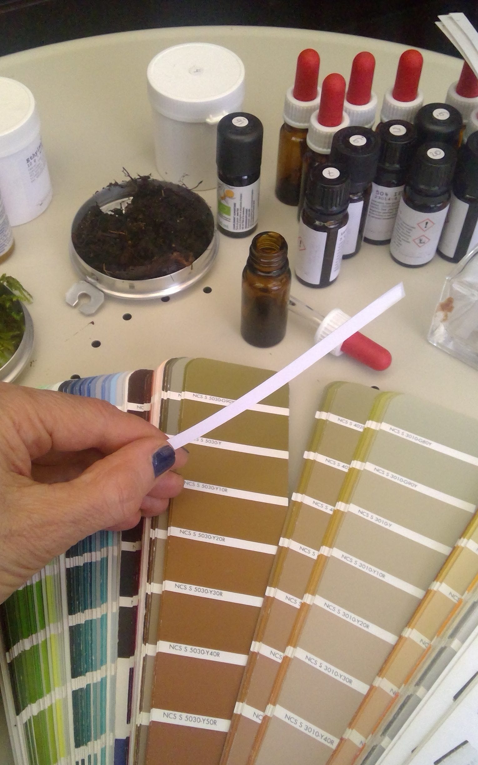
Applied Synaesthetic
Synaesthesia refers to the signified connection between different sensorial systems. Which colours are fresher than others? Just how sweet is pink? What is the sound of a round shape? How does packaging affect the experience of tasting its content? Correctly applied synaesthesia can enhance both a product and the relation to its packaging and presentation. In this session we explore the synaesthetic relationship between olfaction and colour.